Monday 14 December 2015

Looking back at your preliminary task, what do you feel you have learnt in the progression from it to the full product?


Cover Lines
My Preliminary task cover is very basic and barely stands out against the proper one. The cover lines aren't stacked and are unclear making it unreadable. They go over the student making it look cluttered and unprofessional. Whereas on the FLARE magazine the cover lines go around the artists and are a much larger font making them much clearer and readable.

Mast-head
 The mast-head I created for my preliminary task cover is quite small and the colour I chose doesn't allow it to stand out against the background. This has definitely changed for my new cover where its a large vibrant font that stand out clearly against the black background.

Main Article
The problem with my main article on the cover of my preliminary task is that it takes up a lot of space with the black box that it is in which doesn't look very appealing to the eye. However for the real thing the article is very viable and clear. Not only that but it looks more interesting with the font i have chosen as well.

Font
The font of my mast-head doesn't really work with the student theme of the magazine, neither is it large enough. The same goes for the cover lines if they were a larger and more stylised font they would be much more appealing. I chose a varied amount of fonts for my real front cover are much more varied so it doesn't all look the same.

Since creating the preliminary task I have learned how to create a really professional standard looking cover. From looking at so many different magazines and ways of designing one, i realised how it should be presented. One of the main things that I learned was how the cover lines should be equally lined up almost like a column and that numbers should be made really large and clear above the rest of the cover line and the final result is a really professional finish.


I have learned how to use software like InDesign, Fireworks and Photoshop. Beforehand I had no idea how to use them at all, but now I can use them with confidence and ease. From comparing the two covers I can easily tell that my full product is made to a much more professional standard than my preliminary.


What have you learnt about technologies from the process of constructing this product?

http://prezi.com/cgvkdqz7fxz6/?utm_campaign=share&utm_medium=copy&rc=ex0share

How did you attract/address your audience?


 The Front Cover


  • My artists wears a leather jacket and is wearing all black to make it appeal and interest Rock fans, as well as making the background black to give it that dark, almost Gothic feel.
  • To interest Pop fans the cover lines are bright and vibrant and the background is not completely black, to show its not completely aimed at rock.
  • The layout of the cover is layed out neatly and clearly around the artist with bright colours so that it is easy to read.
  • Cover isn't to cramped with cover lines, to keep it clear and interesting to consumers.
  • The world exclusive article instantly interests fans and consumers, know they can read the exclusive article anywhere else.

Contents Page

  • A variety of colours to keep the magazine open to both females and males so its not gender specific. 
  • Page numbers are clear and have different coloured rings around them to make the page easy to navigate and different from other magazines. 
  • The page looks busy and full of  content  to provide the reader with an incentive to read on and read the articles.
  • Modern styled font may interest a younger audience because it feels new .

Feature Article

  • A linear clear layout, which may interest an older audience.
  • A bright and cheerful varied amount of fonts with a mix of red and black colours to intrigue readers.
  • A brief description of the artist to the the older aged audience informed and involved .
  • The article may interest mainly males as the artist  being interviewed is a male.


Who would be the audience for your media product?

http://prezi.com/c-w66ddzh5w6/?utm_campaign=share&utm_medium=copy&rc=ex0share

What kind of media institution might distribute your media product and why?

http://www.slideshare.net/secret/3jIRIYMBPCy5U9

How does your media product represent particular social groups?

http://prezi.com/k5_s-kdbqmfy/?utm_campaign=share&utm_medium=copy

In what ways does your media product use, develop or challenge forms and conventions of real media products?

http://prezi.com/j2j9dcu1lzbb/?utm_campaign=share&utm_medium=copy

Friday 13 November 2015

Page Designs


Feature Article Text Plan


A young star with the potential to rock the world is ready to tell the world what its like being in the spotlight at the young age of 18. Even though Oscar is relatively new to the music industry, he is already being talked about as a future pop-star.

How do you feel with the word going around of you being thought as a "potential  pop star" and does the thought of it scare you?

Being as young and inexperienced as I am, I think it does put a lot of pressure on me to make sure I step up to this level that expect of me... Although I wouldn't say that this scares me because I know I can reach this target. As long as I keep doing what I'm good at and keep creating music that people want to listen to, then I have no doubt that its possible.

Lets get started on the new album that you are releasing, Can you tell us what its all about?

Yea so, my new album  is called "Evolution" and honestly its my personal favourite. I am certain that people will love it,  hopefully it can do just as well as my last 2 albums if not even better. They are the kind of songs that can be listen to many times and I expect them to played many times.

 Was it always your plan to become an artists so early on?

If I'm honest I didn't really enjoy school much, In my free time instead of doing homework I focused on composing my own music, it was like an addiction. I found doing school work and playing music just brought me to life it enabled me to express myself. So in all honesty no, because it means that I can do something that i love doing straight away all the time.

Have you ever considered maybe creating a band or do you like life as a solo artist?

Yea i think it would be really cool if I was part of a band, i mean i grew up loving some classic boy bands, but only time will tell. When i started it didn't really cross my mind, but slowly i have been thinking more and more about it. I think I'll just see how things go and maybe just maybe ill be in one some day, but at the moment I fine with how it currently is.

Who was your main inspiration for becoming a solo artist?

I really loved music by Elton John, he was defiantly the person who really inspired to be something different. He has created some amazing pieces that I loved listening to, becoming something like him is certainly my dream. My initial style was from a different artist that i couldn't stop listening to. Ed Sheeran started of really small and now look at him, and that really made me think about what it would be like.


Friday 6 November 2015

Magazine page layout

Feature article artist planning


My Feature article artist 


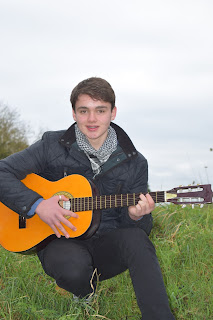
The main artist featuring in my article will be a solo artist. It is a male who goes by the name of Oscar Raven. He is relatively new to the music industry, however he is already creating big ripples in the nearby areas and is mentioned as a young potential star. At the age of 18 Oscar has released two albums at this point both, with both of them reaching the top in local charts. His music varies between pop and rock music, with his main instrument being a guitar.

Oscar is doing the feature article to promote his new album as well as himself as an artist. He's hoping featuring in a big music magazine will massively improve his music presence and help him enter the UK top charts.

As a young artist Oscar is very modern when it comes to fashion. He is normally seen wearing his well known reflective shades, as well as skinny jeans with a dull coloured jumper. This style is best represented with pop as it is happy. However he has been seen on stage wearing much more casual clothes when hes performing rock music. He has two prized instruments including an electric guitar and a classic guitar. A lot of the time he is seen with his classic guitar as he can play it anywhere at anytime as he is always on the move and playing and creating new music. 

For the photo, a close up shot will be used to make it clear what the artist is wearing and what he looks like. The photo won’t have a background, instead it will have a sky blue colour behind it. This is because i think it makes it clearer and better represents the artist. For the photo shoot Oscar won't have any make up instead he will be natural as for pop artists don't necessarily wear a lot of make up like they would for heavy metal. I think it would be best if Oscar was looking straight in the lens to give across a connection with the audience.


Other Artists


One of the other artists that will be featuring in my magazine is Joe Parks, who is very well know in the music industry and has come back to music as he left music behind as he hit hard times. He is a solo artist and his songs tend to be more Rock gender based. Jo comes from London and has done many concerts and tours around the world.  

The second artist which will be included in my magazine will be Danny Jordan. He is 14 years old an is trying to become big and is releasing his second ever album. Danny is yet to have a big hit but hopes that he will achieve this with his newest album. He has only just graduated from university where he was studying music. Jordan now feels ready to enter the music industry.He earned his fame through winning a well known music talent show. He is of a very young age and has created many viral videos on YouTube.


Wednesday 4 November 2015

House Style

House Style

Fonts


For the title of my content page and main article i want to use a bold, clear and easy to read from a distance font. I think the font that best fits this description out of the ones I looked for and selected would be the Eras Demi ITC font. For the main text taking up most of my pages content would be a font that looks appealing to keep the reader reading. It is very important that this font is also clear for readers, so i decided to go with Verdana. My final font will be used for extra things like the page numbers as well as the description for images if needed. I thought the Footlight MT Light font fitted this best because it fulfills these and also is faded out slightly , making it clear to the audience that its not the main content.


Colour Scheme

The kind of colours I think would best suit the genres I have chosen pop and Rock would be slightly dark colours to represent the rock genre part of my magazine. To represent the Pop genre side of my magazine the colours will be eye catchy colours like blue, red and Orange. To make sure my magazine appeals to both genders, it will have to have a range of colours. 


I have decided that the colour of my text would be dominantly a dark red, but if the background image meant it would be clear, then I would use black instead. The general background colour especially for the cover would be a dark blue. I think this would allow the image of the artist to clearly stand out. The titles for the pages will be the same colors as my mast head to show consistency which is grey and red. 


Colour Scheme

A visual feature which I will be using will be to have all of my titles connect through having a similar design by all using the same colours as my mast head. I will also have a smaller version of my mast head in the top right hand corner as well as in the bottom corners of all the pages. This will remind readers of what magazine their are reading.


Thursday 15 October 2015

Initial Ideas and Decision


Initial Ideas


Rock magazine strengths and weaknesses:

This magazine focuses on only one music genre therefor reducing its appeal to a large audience. However this music genre is one of the most popular genres so it should be fairly popular.

Pop and Rock magazine strengths and weaknesses:
This magazine could have the potential to do really well because it includes two of the most popular genres. This means that it can reach a larger audience increasing its chance of being bought. However because it is aimed at both sexes and not just one it may be too broad, making them feel no included.

Music Fashion magazine strengths and weaknesses:
The fact that it is aimed towards women may put off men that may be interested in reading it. If it is a mix between fashion and Pop it could have the potential to work really well.

Rap magazine strengths and weaknesses: This magazine would specialize in Rap music which is a genre is is becoming more popular over time giving it potential to do very well in future if it takes off. Rap appeals to a large range of ages making it hard to narrow it down. This could put some readers off as they may feel it is either to old or young for them.

My Magazine Decision

I have decided that the best choice would be a pop and rock magazine.


Audience Research


Audience Research


I created a survey and gave it out to 10 people and gave 5 of them to females and the other 5 to males to make my results fair and equal. I gave them out to people around the ages 15-18 to give me information about them so that i can create a music magazine that will appeal them. Here are my results;


 The response that I have received from audience is that the least popular music genre for sure is Rap Music. The other two genres Pop and Rock are fairly similar in results with Rock achieving just one more vote.These results really did surprise me as i thought that Rap was by far the most popular genre, but it seems that I was wrong. This shows that these two particular music genres are both equally popular, so it would be beneficial for me to include both Pop and Rock Genres in my magazine. This also means that i will appeal a wider target audience improving my magazine sales.
The answers I received for this question were varied. This makes it clear how the audience like to listen to a variety of musicians, however there was one clear winner was Calvin Harris. I was expecting someone like him to win because his music is popular by both sexes, male and female. From this I now know to include a variety of artists to interest the majority of artists with the majority appealing to both sexes.


From these responses i can see that people are really interested in seeing artists being interviewed, which doesn't surprise me as this is a big part of a music magazine. Although to contradict this i was really surprised that things that can be found through the internet for like the latest news and charts are what people wanted to see. However I was not surprised with the result that new artists are unpopular as they can be easily found through friends and the internet.


Monday 12 October 2015

‘house style’ Research


House Style Research

Billboard Magazine

Q Magazine      

The mast head of Q magazine is always located top left hand corner, which is so that this is what readers see first. This is also so that they are aware of the image of the artist. The colours white and red are always consistent for the mast head.

 The predominant colours used  are mostly black red and white, which make reference to the magazines mast head. The strap lines are always red and black which distinctively identifies each one and allows for easy navigation.

A lot of the time the masthead is covered by an artist, which shows that the image is more important.

The shots used are more often than not medium shots of the person. This is so that we can see more then just a face. Instead we can see what they are holding and wearing .


Monday 5 October 2015

Magazine content Page Analysis


Magazine content Page Analysis


Magazine Article Analysis


Magazine Article Analysis


Q Magazine Article

This article is very cleanly layed out, so that it is pleasing to the eye. The featuring artist is included in the background looking very calm and relaxed with his guitar. This is also used mirrored on the front of the cover.The background has a very relaxed theme because the lighting has been dimmed. The cover of this magazine also has a very dim background. This is to draw customers eyes away from the background to the main artist.  The background behind the text is white so that the black coloured text is clearly visible.  This all suggests that this is an article about this artist on a personal level, which attracts fans to purchase the magazine. The subheading is a quote from the artist which also shows that its personal and trying to connect with its readers. Its in a large vibrant front to stand out from the background. The page number is highlighted in red which continues the house style of the double page.

This article supports the artists style by being so relaxed and chilled with his guitar leaning against a wall. Their is a quote which reads
"I'm bringing Ginger back", this suggests that hes going return to music as a different person and come out with some big hits that will change music. The background of a city shows that he is a city boy and loves the city. The central image of Ed Sheeran leaning and looking at the camera symbolises how casual and unmoved he is. The clothes that he wears suggests that hes not the kind of person that wants to stand out, but instead blend in.

The purpose of this article is for this artist to return to the music industry, but in a new light and as a new person. The magazine quotes "i'm bringing ginger back" which suggests that hes bringing in his own new type of music. This quote isn't very specific and could mean a number of things which really engages the reader because they know it means something will be different. The article is trying to advertise and make it clear of this artists come back.

The presentation of the artists article suits the magazines audience due to how basic it is set out. As 83.8% of the readers are 15-44 years of age it needs to be reasonably easy to read. The artist Ed Sheeran was a good choice as he is popular amount most 14-30 year olds. There isn't too much information either so the readers are kept interested, a whole page is dedicated to the image of the artist.

This article has a mysterious tone as you cant really tell whats going on in the picture. The artists is looking inquisitive and the picture looks as if it had all of its light and colour drained out of it. Not only this but i also think its supposed to have a chilled tone about it due to how laid back and relaxed the picture looks and feels.  In this specific article the reader is directly spoken to by the artist him self as he tells the secret of how he returned and got to the top of the charts. Its in a friendly manner and trying to involve the reader in the interview.

The layout and overall style is very limited and basic because it doesn't want readers to focus on them. The background also fills up both of the two pages only being covered by the article's interview. Red is obviously the highlighting colour as it is used various times throughout the article to highlight key parts.

The main image defiantly adds to the overall look of the article because it changes the whole page from a plain boring white to a much more exciting background image. The image also supports the text because it helps you imagine who the artist is and learn a bit more about his personality.


The layout of the magazine has a strong link with the artist featuring in the article. The background is a light pink which can be linked to this artists stereo typically because she is a girl. She is also well know for being quirky and crazy this represents her personality pretty well. The pink colour is also used on the front cover of the magazine. btoth the article and the main cover have very plain, basic backgrounds because they have limited importance the main thing they want views to realise is the artists.


Magazine Cover Analysis


Magazine Article Analysis


Thursday 1 October 2015

Music Magazine Readership Profile

Music Magazine Readership Profile


MagazineCombined Total Average CirculationCombined Total Prior Period Change
Kerrang!33,024-5.99%
Mojo70,667-4.77%
NME15,830-18.78%
Q48,353-8.39%


Q Magazine


The magazines logo is very bold and simplistic. The font used for the Q is also very simple. This simplicity suggests that its aimed towards older people. .It has two contrasting colours which are red and white. This makes it very eye catchy to consumers.

The main image is of a band member from the 'foo fighters'. This person is fierce and aggressive looking.  This is because its trying to appeal to those who are interested in 'rock and roll'. All of the characters on the front of the page are men, this could possibly mean that their main audience is men.


The majority of Q's readers are male, with 66.2% being male. Statistics show that 83.8% of the readers are 15-44 years of age. This shows Q's ability to appeal to a wide range of audiences. Q does this by featuring popular artists on the front of its magazine.


KERRANG! Magazine


Kerrangs masthead is broken up by lines and has an explanation mark at the end of it. This design is supposed to appear out of control. From this you can tell that they are trying to appeal to rockers and heavy metal lovers.

Kerrangs type of readers are quite similar to Q's. It has quite an even ratio for gender, however there are slightly more men than women. The type of age range that reads the magazine is often between the ages of 15-34.


Vibe Magazine


This vibe cover has its masthead in big bold font, this links in with the main image used which is of a strong man. The man on the front is supposed to be a role model towards men and catch their attention.  The general gender of the average reader is very even, 50.5% of them are males, meaning the other 49.5% are women. The age range for this magazine is 18 to 34 year olds, with 71.2% of the audience for Vibe magazine being of this age range. Few of vibe's readers ever went to college after secondary school. Only 50.7% of them went to college, with 19%  currently studying in college. Therefore the  magazines content is fairly basic as . However.73.9% of the audience is currently employed.


ADULTS Men 55% Women 45% AGE 18-24 35% 18-34 67% 21+ 82% 35+ 29% Median Age 30 EDUCATION Any college 55% Currently in college 20% EMPLOYMENT Employed 62% HHI Income $52.5k Black/African AMERICAN 75% White 15.9% Spanish/Hispanic/ Latino 12.4% Asian 1% Other Race 11.3% 


at least 3 music magazine
reasearch and anylyse their TR carefully and in detail.
write findings
appealing to target
how attract men
why does it appeal to those readership profiles