
Friday, 16 October 2015
Thursday, 15 October 2015
Initial Ideas and Decision
Initial Ideas

Rock magazine strengths and weaknesses:
This magazine focuses on only one music genre therefor reducing its appeal to a large audience. However this music genre is one of the most popular genres so it should be fairly popular.
Pop and Rock magazine strengths and weaknesses:
This magazine could have the potential to do really well because it includes two of the most popular genres. This means that it can reach a larger audience increasing its chance of being bought. However because it is aimed at both sexes and not just one it may be too broad, making them feel no included.
Music Fashion magazine strengths and weaknesses:
The fact that it is aimed towards women may put off men that may be interested in reading it. If it is a mix between fashion and Pop it could have the potential to work really well.
Rap magazine strengths and weaknesses: This magazine would specialize in Rap music which is a genre is is becoming more popular over time giving it potential to do very well in future if it takes off. Rap appeals to a large range of ages making it hard to narrow it down. This could put some readers off as they may feel it is either to old or young for them.
My Magazine Decision
I have decided that the best choice would be a pop and rock magazine.
Audience Research
Audience Research
I created a survey and gave it out to 10 people and gave 5 of them to females and the other 5 to males to make my results fair and equal. I gave them out to people around the ages 15-18 to give me information about them so that i can create a music magazine that will appeal them. Here are my results;
 The response that I have received from audience is that the least popular music genre for sure is Rap Music. The other two genres Pop and Rock are fairly similar in results with Rock achieving just one more vote.These results really did surprise me as i thought that Rap was by far the most popular genre, but it seems that I was wrong. This shows that these two particular music genres are both equally popular, so it would be beneficial for me to include both Pop and Rock Genres in my magazine. This also means that i will appeal a wider target audience improving my magazine sales.
 The answers I received for this question were varied. This makes it clear how the audience like to listen to a variety of musicians, however there was one clear winner was Calvin Harris. I was expecting someone like him to win because his music is popular by both sexes, male and female. From this I now know to include a variety of artists to interest the majority of artists with the majority appealing to both sexes.

From these responses i can see that people are really interested in seeing artists being interviewed, which doesn't surprise me as this is a big part of a music magazine. Although to contradict this i was really surprised that things that can be found through the internet for like the latest news and charts are what people wanted to see. However I was not surprised with the result that new artists are unpopular as they can be easily found through friends and the internet.


From these responses i can see that people are really interested in seeing artists being interviewed, which doesn't surprise me as this is a big part of a music magazine. Although to contradict this i was really surprised that things that can be found through the internet for like the latest news and charts are what people wanted to see. However I was not surprised with the result that new artists are unpopular as they can be easily found through friends and the internet.
Monday, 12 October 2015
‘house style’ Research
House Style Research
Billboard Magazine

Q Magazine

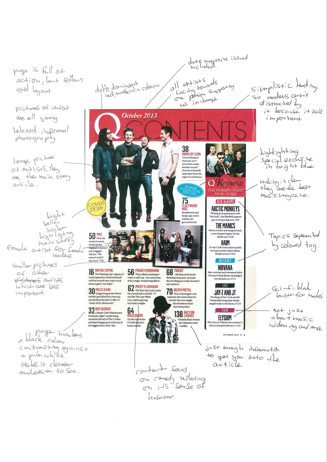
The mast head of Q magazine is always located top left hand corner, which is so that this is what readers see first. This is also so that they are aware of the image of the artist. The colours white and red are always consistent for the mast head.
A lot of the time the masthead is covered by an artist, which shows that the image is more important.
The shots used are more often than not medium shots of the person. This is so that we can see more then just a face. Instead we can see what they are holding and wearing .
Monday, 5 October 2015

Magazine Article Analysis
Magazine Article Analysis
Q Magazine Article


This article supports the artists style by being so relaxed and chilled with his guitar leaning against a wall. Their is a quote which reads
"I'm bringing Ginger back", this suggests that hes going return to music as a different person and come out with some big hits that will change music. The background of a city shows that he is a city boy and loves the city. The central image of Ed Sheeran leaning and looking at the camera symbolises how casual and unmoved he is. The clothes that he wears suggests that hes not the kind of person that wants to stand out, but instead blend in.
The purpose of this article is for this artist to return to the music industry, but in a new light and as a new person. The magazine quotes "i'm bringing ginger back" which suggests that hes bringing in his own new type of music. This quote isn't very specific and could mean a number of things which really engages the reader because they know it means something will be different. The article is trying to advertise and make it clear of this artists come back.
The presentation of the artists article suits the magazines audience due to how basic it is set out. As 83.8% of the readers are 15-44 years of age it needs to be reasonably easy to read. The artist Ed Sheeran was a good choice as he is popular amount most 14-30 year olds. There isn't too much information either so the readers are kept interested, a whole page is dedicated to the image of the artist.
This article has a mysterious tone as you cant really tell whats going on in the picture. The artists is looking inquisitive and the picture looks as if it had all of its light and colour drained out of it. Not only this but i also think its supposed to have a chilled tone about it due to how laid back and relaxed the picture looks and feels. In this specific article the reader is directly spoken to by the artist him self as he tells the secret of how he returned and got to the top of the charts. Its in a friendly manner and trying to involve the reader in the interview.
The layout and overall style is very limited and basic because it doesn't want readers to focus on them. The background also fills up both of the two pages only being covered by the article's interview. Red is obviously the highlighting colour as it is used various times throughout the article to highlight key parts.
The main image defiantly adds to the overall look of the article because it changes the whole page from a plain boring white to a much more exciting background image. The image also supports the text because it helps you imagine who the artist is and learn a bit more about his personality.


The layout of the magazine has a strong link with the artist featuring in the article. The background is a light pink which can be linked to this artists stereo typically because she is a girl. She is also well know for being quirky and crazy this represents her personality pretty well. The pink colour is also used on the front cover of the magazine. btoth the article and the main cover have very plain, basic backgrounds because they have limited importance the main thing they want views to realise is the artists.


Thursday, 1 October 2015
Music Magazine Readership Profile
Music Magazine Readership Profile
Q Magazine

The magazines logo is very bold and simplistic. The font used for the Q is also very simple. This simplicity suggests that its aimed towards older people. .It has two contrasting colours which are red and white. This makes it very eye catchy to consumers.
The main image is of a band member from the 'foo fighters'. This person is fierce and aggressive looking. This is because its trying to appeal to those who are interested in 'rock and roll'. All of the characters on the front of the page are men, this could possibly mean that their main audience is men.


The majority of Q's readers are male, with 66.2% being male. Statistics show that 83.8% of the readers are 15-44 years of age. This shows Q's ability to appeal to a wide range of audiences. Q does this by featuring popular artists on the front of its magazine.
KERRANG! Magazine

Kerrangs masthead is broken up by lines and has an explanation mark at the end of it. This design is supposed to appear out of control. From this you can tell that they are trying to appeal to rockers and heavy metal lovers.
 Kerrangs type of readers are quite similar to Q's. It has quite an even ratio for gender, however there are slightly more men than women. The type of age range that reads the magazine is often between the ages of 15-34.


Vibe Magazine
This vibe cover has its masthead in big bold font, this links in with the main image used which is of a strong man. The man on the front is supposed to be a role model towards men and catch their attention. The general gender of the average reader is very even, 50.5% of them are males, meaning the other 49.5% are women. The age range for this magazine is 18 to 34 year olds, with 71.2% of the audience for Vibe magazine being of this age range. Few of vibe's readers ever went to college after secondary school. Only 50.7% of them went to college, with 19% currently studying in college. Therefore the magazines content is fairly basic as . However.73.9% of the audience is currently employed.
ADULTS Men 55% Women 45% AGE 18-24 35% 18-34 67% 21+ 82% 35+ 29% Median Age 30 EDUCATION Any college 55% Currently in college 20% EMPLOYMENT Employed 62% HHI Income $52.5k Black/African AMERICAN 75% White 15.9% Spanish/Hispanic/ Latino 12.4% Asian 1% Other Race 11.3%
ADULTS Men 55% Women 45% AGE 18-24 35% 18-34 67% 21+ 82% 35+ 29% Median Age 30 EDUCATION Any college 55% Currently in college 20% EMPLOYMENT Employed 62% HHI Income $52.5k Black/African AMERICAN 75% White 15.9% Spanish/Hispanic/ Latino 12.4% Asian 1% Other Race 11.3%
at least 3 music magazine
reasearch and anylyse their TR carefully and in detail.
write findings
appealing to target
how attract men
why does it appeal to those readership profiles
Subscribe to:
Comments (Atom)